Since being released over three years ago, I’ve been a huge fan of Stern Insider Connected. I look forward to signing in whenever I play Stern Pinball, whether it be on location or home use only (HUO) games we bought this year.
If you’re new to reading this publication, we actually have an entire category dedicated to Insider Connected (https://playgamesmore.com/category/insider-connected/), every month we report on new badges, quests and IC-related happenings and have been doing so for well over a year now. Often, I look forward and excitedly to sharing these fun news quests, badges and events and you can read my enthusiasm and passion for IC in prior articles like this: OPINION: Stern Insider Connected is Positive for the Future of Pinball + September 2024 Insider Connected Seasonal Quests.
I’m such a big fan that I’ve argued with anti-IC people online and offline (OPINION: Stern Pinball has Feature Every Modern Pinball Needs) that say it’s unnecessary for modern pinball to be connected, they don’t want connected pinball, yadda, yadda. I’ve shared future wishlists and promoted the program to local operators.
Lastly, and importantly, I’m not a Stern employee, PGM is not sponsored by or affiliated with Stern. Am just a totally independent pinballer who loves pinball, has been playing the game for 50+ years, and in favor of Insider Connected as being something pinball needs.
That all said, I expect the program to change. Who wouldn’t? It needs to evolve and be improved, but I don’t want, and nobody does, the program to become worse.
Recently, Stern upgraded IC and I’ve found much more to dislike than like about most changes made so far. I’m still getting used to the changes and maybe I’ll learn to appreciate at least some of it in time, but right now, I’m utterly and completely confused how anybody inside Stern thought this would be received in its current incarnation positively.
If you think it couldn’t possibly be worse than what they had before, stay with me for the many examples that follow and judge for yourselves.
Let’s start with the good, the positive, and if they had simply stopped with what’s next, most users would have been happy:
They seem to have — finally — fixed the login properly remembering us
This is a big one. So many people didn’t use the app or even the website because they were constantly being logged off. This isn’t just big, this is huge fix, so thank you, Stern. This is easily the best thing about this updated version.
Sadly, that’s about it for what I like about the new IC. Let’s get to the long list of what I don’t like after using this new user interface (UI) for days, both the mobile app and desktop version:
Nearly everything we were used to looking at/for has changed!
Seriously WTF?! I want to see my current play stats? Nope, that’s no longer in the same place. We changed it. I think this is supposed to be what has replaced it (the small summary section at the top) available here: https://insider.sternpinball.com/players/todd_russell/stats — you can replace “todd_russell” with your name to get to your stats page.

Scroll south forever to see the games instead of having them formatted in multiple columns as they were before, only missing some of the data previously provided (keep reading!).
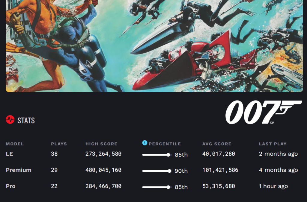
How about total play stats by version for every game on one nice easy to read page with total plays? Nope, gone.
Before, want this back — these cool summary pages showing what your stats were, highest games and number of games played per version (pro, premium and LE):
Instead, now we get this in the new, downgraded version:
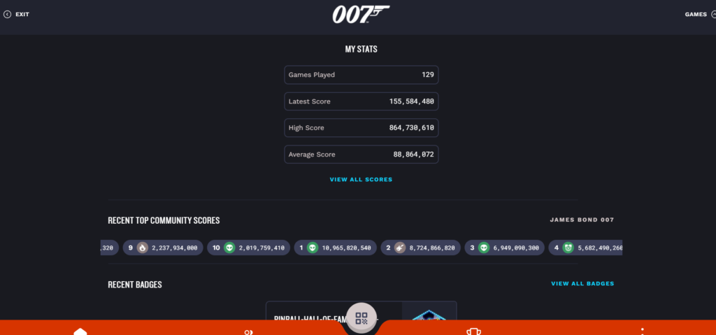
The community scores endless scroller? That’s somewhat of a neat idea, but you can’t click through on it and see some kind of static list, it’s just news ticker scroller that blows by and it’s like, “Ok, yeah, we get it, people all over the world are playing and scoring right now.” It’s the weirdest kind of useless flex when if it was actually clickable, one could see a real time ranked list.
How about stats for badges? How many people have earned a badge? Gone.
Here’s what we used to see, before the upgrade, and it was cool, because it showed how many people earned the badge and, thus, how rare it was to earn:
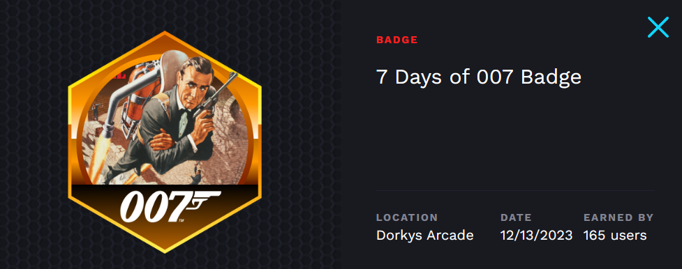
I was one of 165 people in the world to have earned that badge. Sure, doesn’t mean that much. it’s just a virtual badge, but how is what follows any kind of improvement?
That same badge looks like this in the current, upgraded version:

So they sandwiched in both their trademarked logos in the latter, where they didn’t exist in the former. Congratulations for knocking us on the head with your logos and taking away actual, valuable, pride-worthy statistics in favor of extraneous branding.
And why did they remove the stat of how many people had earned it? To hide the total number of people that were interested in earning a badge? Was this merely a popularity check and Stern was embarrassed that some of their activity wasn’t at the level they hoped for? I mentioned when they released the “limited” contract badges that 2,000 was too many. They adjusted the numbers after that feedback and no other limited contracts had that many people. Now, we never know how many people there will be? How will future contract badges work(?)
I’m hoping this is a mistake. Poor execution and it will be added back. Vanity and secrecy are not good reasons to hide this stat.
In the meantime, reporting back less stats should presumably speed up performance, the opposite appears to be happening, at least in my experience to date.
Load times have worsened, seeing a waiting icon on practically every switch from page to page to page:
In fairness, maybe the load times have gotten worse because more people are finally using the app, but Stern needs to put more hamsters in the wheels. This is frequently painful to navigate (and I have extremely good internet as a frequent streamer), offering little to no logical organization and flow. It’s like a pinball machine where you can’t see flippers.
Instead of actual statistical information we might want and need, we’re seeing stuff like our last scores at certain locations?
Ok, yes, if I’m at a location playing *right now* I want to know what those scores were, how many times I played, but is that more important than a summary view of all games played and top score on each game? I’d say no, but somebody inside Stern that designed this mess thinks yes, we want to see it this way.
I want to see on one nice, easily organized page like you had before how many games I’ve played and my highest score. Instead, now I’m forced to look through multiple individual pages and figure this out how, where? This isn’t an at glance summary page, it’s broken up by machine and in many cases by location then machine. Sigh.
There are some moments where you might want to know where to find a certain IC game near you and luckily that hasn’t changed. They decided to tell us the game that is represented the most in our areas like this:
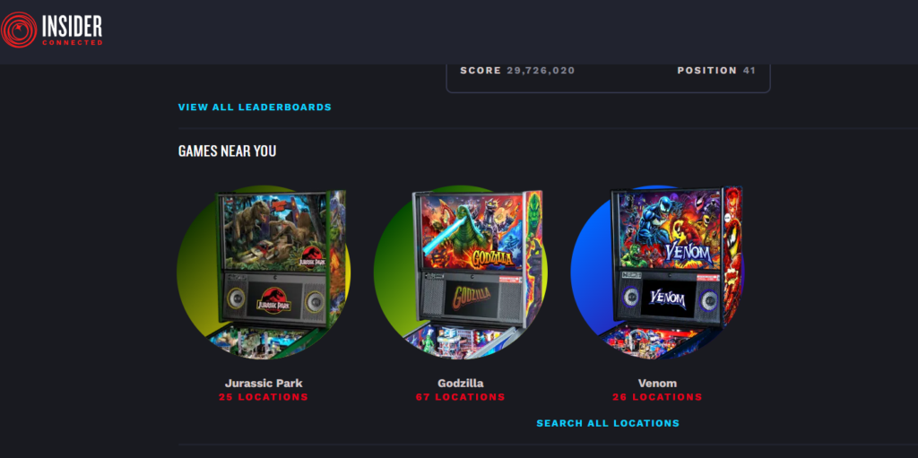
There are more Godzilla games with IC than any others near me. Already knew that. Give me back my play stats and positions on badges instead, please!
What about finding a launch party? You used to be able to just go to the launch party page and see that, but now it’s buried within each location(?) Why? Yes, it should be there by location, but shouldn’t you have a central “launch party page” that is location specific to each user? Shouldn’t that be the topmost page?
Horrible, horrible, horrible.
The mobile and desktop views are way too similar, leaving a bunch of unused space on the desktop view
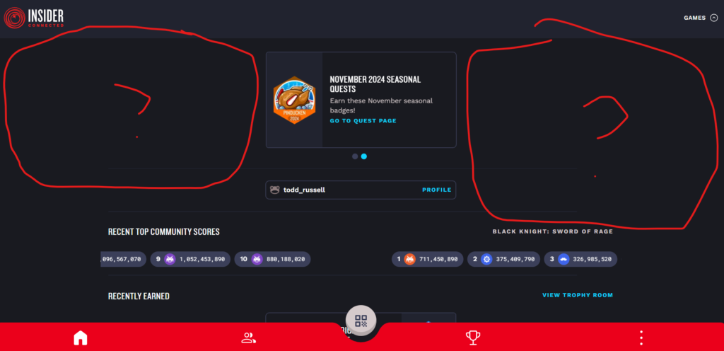
Seriously, look at the desktop version above and it’s basically the same as the mobile version. This is a major UI fail, there should be separate display versions depending on the device that’s viewing (desktop, mobile, tablet). You shouldn’t format a desktop website with almost identical view as mobile. That’s a huge user letdown and total waste of web space that could be utilized.
I could go on and on and on, but it’s time to eject on this train wreck. Try it for yourself but I dare anybody to say this is an improvement in the comments over what we had before. It’s a dramatic downgrade. Sorry, but I’ll debate that in advance.
Yes, we want to see Insider Connected change and improve for the better. This ain’t it.

Dean Stantoine – sorry, but this is not the moment we’ve been waiting for. 🙁 This is like eating at your favorite restaurant and becoming ill from food poisoning a few hours later.
Wish I could simply dislike this, but find this new version completely, utterly broken EXCEPT for the login system which is dramatically improved. As mentioned at the beginning of this article, I’ve been a huge fan and supporter of IC, but this new version has turned me extremely cold to the system. It’s so bad, I’m contemplating stopping covering monthly IC updates on this site. Stern is rapidly losing me as a fan with this stupid, irritating, incompetent update.
When they fix this mess — and they definitely should — my excitement likely could/will return. Give us a rollback in the look and stats to how it used to be. Give us back the stats they took away. Give us back our old IC look and stats and get rid of this 2.0 version which is a major disappointment.
Dean seems like a good guy, he’s a friend on Facebook and I like the guy, and he runs a growing group of dedicated IC fans. This past week since this messy upgrade released, I’m not seeing much love and positivity coming out of this group for these changes. Instead, I’m seeing confused, cautious and stunned fans.
Where is this? Where is that? Where did that go that we used to … oh, it’s not there? Oh.
Not ringing endorsements from a crowd of users that like using the program. Just imagine the ammunition for people that don’t like.
In fact, one of the group members has already gathered a list to send to Stern IC support. I’m just going to include a link to this article for my thoughts on their program and add this direct message to the IC team below:
If you wanted feedback before you released this, myself and others would happily have given it to you in beta, you know, before it was released.
After you publish something and force it upon all of us, then we are free to leave our comments wherever and however we want. Here’s my three word review:
This update sucks.
Fix it and get back to us with something much better. Start by giving us back what you inexplicably took away. Revert and come back to what you wanted to do in the future by taking what we liked in the past and offering improvements.
I’m not a huge fan anymore with the newest version. Sorry, the Stern IC team gets a C- for effort and F for execution. Oh, and yeah, while at it, they should refund me and others for the bogus “all access” plan (see: Worthwhile? Upgrading to Stern Insider Connected All Access ($39.99 USD/year) + Special Access to Buying JAWS Limited Edition) that didn’t give me any benefit except being maybe, possibly, hopelessly able to buy an LE from you for $13,000. Meh.
At the very least Stern could have given me access to the beta of this awful IC update so I could have given them all this feedback before they unleashed this mess upon the rest of the pinball world.
This ranks in my dozens of years on the internet as one of the single worst upgrades ever made online.
UPDATE 11/11/2024 @ 7:18am PST: After sharing this in the Facebook Group “Stern Pinball Insider Connected Enthusiasts” (https://www.facebook.com/groups/892839409087535) this morning, I went back and forth with a gentlemen online named Walt Carothers. I don’t know this person and obviously from our exchange, he doesn’t know me. That’s cool, I like to make new friends online and sometimes in this world disagreements can be olive branches to new friendship and acquaintances.
Mr. Carother’s started our exchange with a meme of a crying man and saying there are bigger problems in the world. Then he attempted to correct information “I couldn’t seem to find” and ultimately, he decided to apologize “if” he attacked me.
See Mr. Carother’s exact response below:
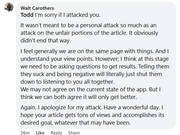
Here’s my response, which I’m posting here instead of there. Maybe next time, Walt, we can have a conversation in the comments section here instead of on the Facebook group, but hey, I’ll take feedback wherever it’s made.
Walt Carothers – I’ll accept your apology, I don’t mind criticism of anything published on our site and, again, I will always correct and credit any mistakes or misinformation. I will even clarify something that wasn’t stated clearly. That’s being professional. However, I won’t correct my opinion differing from others. That’s spineless and weak and I don’t traffic in that sort of editorial. We all have a right to our opinion, you equally as me🙂
If the Stern IC team shuts down after something so petty as reading my article, then they all should be re-assigned or terminated and replaced with a competent team that can take thoughtful, deliberate customer feedback and take appropriate action upon it. My criticisms, although definitely harsh, gave them specifics on how to make it better. It came from a thoughtful, caring place that I don’t want to see something I’ve personally fought for and defended destroyed.
Your silly meme response was misguided and ill-placed, but I’ll overlook and accept your apology. It demeans the seriousness of real problems that do exist in the world. No, Stern Insider Connected isn’t feeding the homeless, fixing the mental health crisis, stopping wars or any of dozens of other much bigger world issues that truly matter much greater than this small little game thing. Of course, any sane, reasonable human being can make these distinctions.
I rarely write about those heavy topics because these are strongly divisive and not fun, I write about games, entertainment and the technology that fuel them. Fun, it’s supposed to be, you know 🙂 It’s not fun being frustrated when something liked has changed — for the worse. My concern with IC is in *Stern’s world” — and my feedback is meant to be heard and acted upon by the Stern IC team, not discarded as some mean-spirited screed from someone that doesn’t like and want the company to succeed. It seems at least that we both seem to agree on that. For that I’m grateful. You have a good day, as well!

I hope in a feature release we get some more options to customize our experience. I would really like a feed, or something like it to see what badges, and scores my friends are receiving.
Somethings I did enjoy with this update aside from what Todd mentioned is notifications are coming through now, and also being able to find games inside the app.
I would say, from the very very little I know, you most likely hit it on the head, they are hiding the numbers. It reminds me when Rocket League changed from having the number of players online at a give time – for server health – to a grading system that never grades poor no matter how long it takes to get a match. Lastly, facebook just be that way in my experience.
Thanks for reading and taking time to comment, Bob. Seems this might have hit a nerve for some. That part you’re referencing is pure speculation on my part. Am I right? Maybe, maybe not. We’ll probably never find out the answer. If there is any truth to it, I sincerely hope Stern doesn’t hyperfocus on little things like that. They are already #1, they don’t need to worry about their popularity. They need to focus on making great games. IC could grow into the bigger app than their pinball machines, imagine that? Because people don’t need to buy a pinball machine to enjoy IC and there is a path for them to monetize IC at some point — far beyond the “all access” plan. And that’s part of what seems to scare others that they see the potential of making people pay for stuff that is “free” now. I realize their server infrastructure for IC isn’t free and is costing Stern $$. I think at some point they are going to have to charge some folks for it and said as much in previous articles.